Big Red Bus Websites - Camden
What is a responsive website?
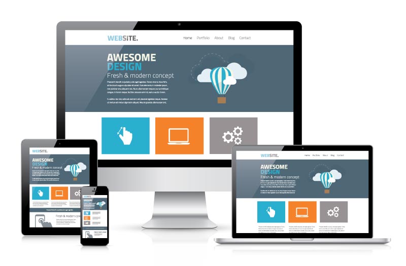
Big Red Bus specialises in designing websites so that they can be properly seen on all your devices: mobile and smart phones, tablets and computers.
Commonly called ‘mobile friendly’ or ‘responsive’, our designs automatically change depending upon the device, so that the content looks just as good and is as easy to navigate on a little screen as a big one.
Websites for a new age
If you think your old computer website is doing just fine, think again. In recent years, mobile and smart phones are the most commonly used devices for browsing.
These days, potential buyers can be anywhere when they want information. They are not necessarily sitting at a desk. You want them to find you and you want to convince them of the benefits of your product or service.
A responsive website is a powerful tool for four reasons:
First, a responsive website is favoured by Google. This is a clear benefit when you want your business to be found by Google customers searching for your product.
Second, a well-designed responsive website guarantees a positive, clearly branded, consumer experience. Whatever the device, website content will re-size to the screen.
Third, having a single platform for all devices means that content management is shared. Updates and design changes only need to be done once.
Finally, when it comes to marketing you only have to concentrate on the one URL. This simplifies the interaction that your responsive website has with social media platforms.